.avif)


A Microsite as a Playground
Travel Next Level started as a compact affiliate microsite created together with CHECK24, but the ambition was broader than building a simple promotional page. The project needed to feel like a proper digital travel experience: visually rich, easy to explore, and flexible enough to support future partners, destinations, and content updates.
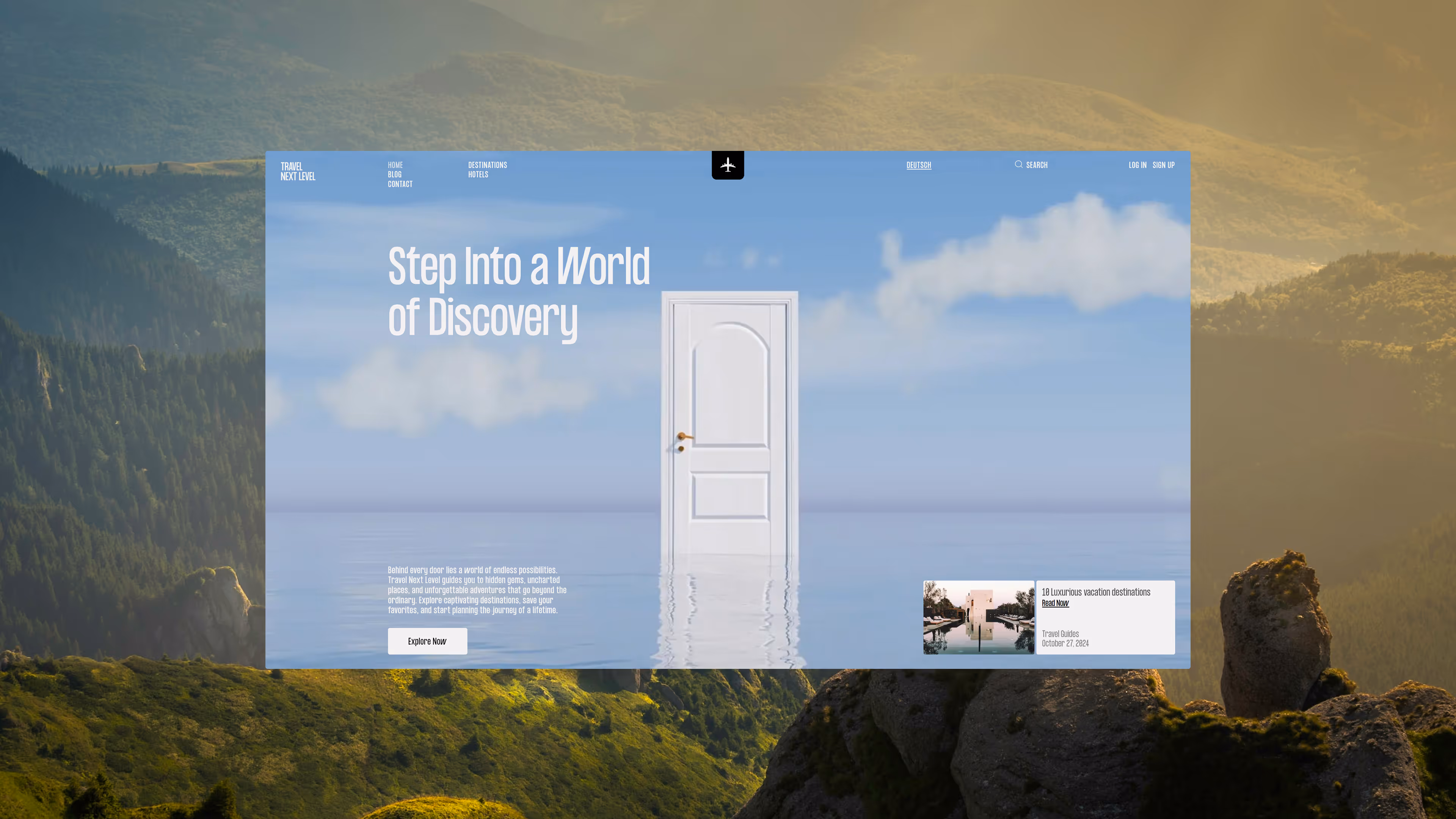
The central idea came from one simple image: an open door. Travel often begins with that exact feeling of crossing into the unknown, entering a new country, and adjusting to a different rhythm, culture, and atmosphere. Instead of overcomplicating the concept, we used the door as a clear metaphor for discovery. It became the emotional entry point of the website and helped shape the first interaction, the visual direction, and the overall sense of movement throughout the experience.
A Microsite as a Playground
Microsites are often treated as temporary, limited, or purely functional. For this project, that limitation became the main opportunity. A smaller structure forces every decision to carry more weight. There is less room for unnecessary sections, decorative complexity, or vague storytelling, which makes the concept, pacing, and visual hierarchy even more important.
Travel Next Level was designed around that constraint. The experience needed to be simple enough to understand immediately, but still memorable enough to feel different from a standard travel landing page. High-quality destination imagery became the foundation, while motion, typography, and the entrance sequence created the sense of immersion. The goal was not to reinvent how travel content works, but to give a familiar structure a stronger emotional hook.
Visual Direction
The design approach was intentionally minimal. Travel websites already rely on vivid photography, hotels, destinations, and lifestyle imagery, so the interface did not need to compete with the content. Instead, the layout was built to create space around it. Large typography, generous whitespace, and a restrained visual system allowed the imagery to remain the main focus while giving the website a more editorial and polished feel.
The content structure follows familiar patterns: destinations, hotels, articles, continents, saved locations, and partner-related features. What makes the experience feel more distinctive is the way these patterns are introduced and connected. The website does not try to overwhelm the user with options from the first screen. It gradually opens up, moving from a conceptual entrance into a more practical travel platform.
Interaction and Content Features
One of the important goals was to give users more than one way to engage with the content. Since the platform includes article-style material, audio playback was added as an additional layer for people who prefer listening instead of reading. This small feature gives the experience more flexibility and makes the content feel less static, especially for a travel platform where users may browse casually rather than search with a fixed goal.
The “saved destinations” feature became another important part of the system. It allows users to collect destinations and return to them later, making the microsite feel more like a lightweight product than a static affiliate page. Memberstack was used to manage account states, saved content, and conditional visibility, allowing the interface to adapt depending on whether someone is browsing as a guest or logged in as a user.
Mobile Experience
The mobile version was not treated as a simplified copy of desktop. The goal was to preserve the same level of interaction, image quality, and visual rhythm across smaller screens. Since travel content is often consumed on mobile devices, the experience needed to feel equally polished there, not like an afterthought.
Large typography, focused sections, clean spacing, and direct actions helped keep the mobile interface clear. Functional elements such as language switching, account access, and saved destinations were placed where they could remain accessible without interrupting the visual flow. The result is a mobile experience that keeps the same atmosphere as desktop while remaining practical and easy to navigate.
A Platform Ready to Grow
Although the project began as a microsite, the system was designed with future growth in mind. Multilingual content, account-based features, saved destinations, and partner flexibility all required a structure that could expand without becoming difficult to manage. Webflow handled the content foundation, while Memberstack, Amazon S3, and Cloudflare supported the more dynamic parts of the experience.
Travel Next Level shows how a compact project can still carry a strong concept, polished design, and meaningful functionality. The final result is not just a travel landing page, but a scalable digital platform built around discovery, visual clarity, and the simple emotional moment of stepping into somewhere new.