.avif)




Cantor8 — Making Infrastructure Visible
Cantor8 builds blockchain infrastructure for institutions and corporations within the Canton Network ecosystem. Their existing website was built on a template, and it left a basic question unanswered: what does the company actually do?
The redesign needed to communicate the institutional scale of the business and make its products easier to understand. The challenge was finding a visual direction for something you can’t easily show. There was no physical product to photograph or single interface that could explain the whole offering.
We started with a 3D concept built around the logo and individual product nodes. Through several homepage iterations and conversations with the team, that idea changed. This case study follows that process: why we moved away from the first concept, how connections became the foundation of the design, and how we carried that idea into development.
The First Concept
Our first approach centred on 3D graphics. We explored a composition around the Cantor8 logo, with glowing nodes representing individual products.
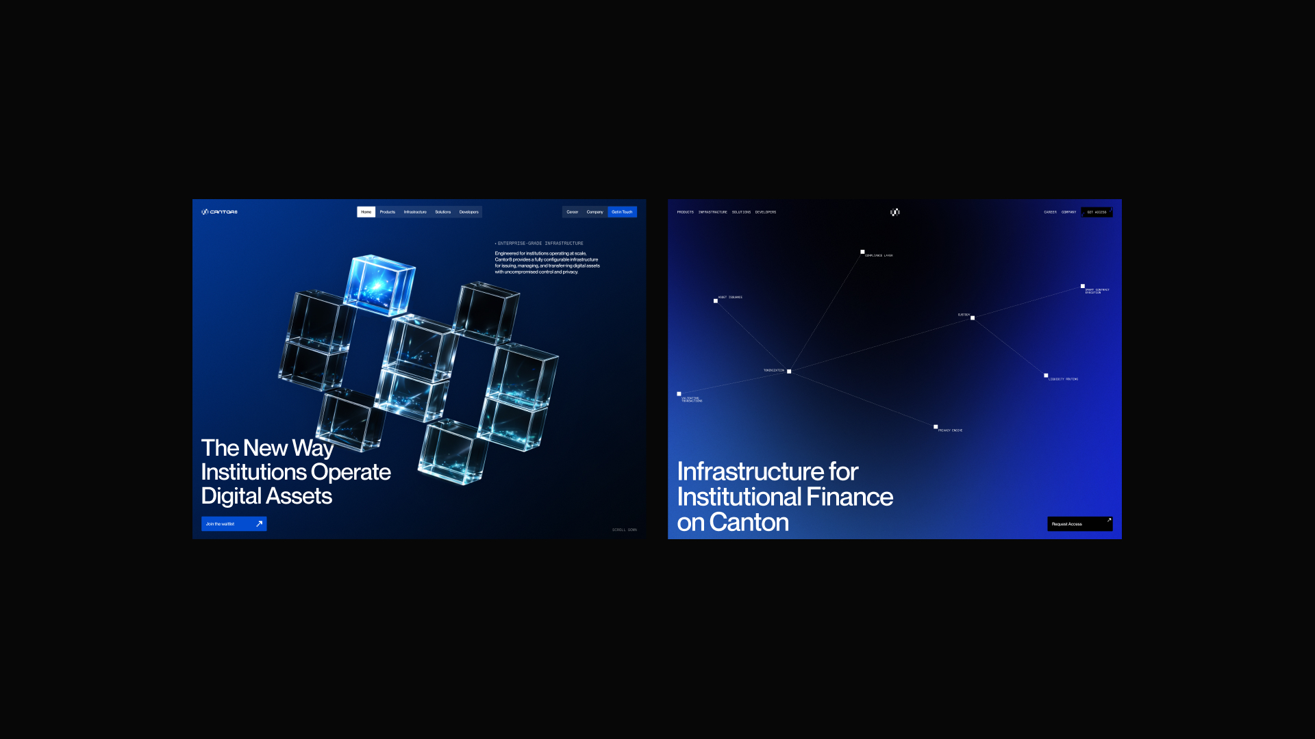
The logic was straightforward: the logo connected everything, and each node gave a product its own place within the system. It gave us something concrete to work with early in the project. But as we discussed the direction with the team, it became clear that the product offering would keep changing. New products would be added, and existing ones would develop further. Connecting each product to a specific node made the composition dependent on the current lineup.
What would happen when another product arrived? Would we add another node, rearrange the composition, or rebuild the visual? That was a limitation worth resolving during the concept stage. There was also a question of tone. The glowing 3D treatment looked familiar for a blockchain project. It suggested the industry quickly, but it didn’t give us enough of the institutional character we were looking for.
The first concept helped us identify what the next version needed: a way to express connection without making the entire image depend on a fixed number of products.
Finding a Direction That Could Grow
We kept working with nodes and connectors, but changed how we used them. They became a way to show relationships between blocks and components throughout the website. This was a useful shift. The first approach was a specific composition. The new direction gave us a principle we could apply to many compositions. The main visual, product graphics, and smaller supporting elements could all share the idea of connection. They didn’t need to look identical. They needed to feel related.
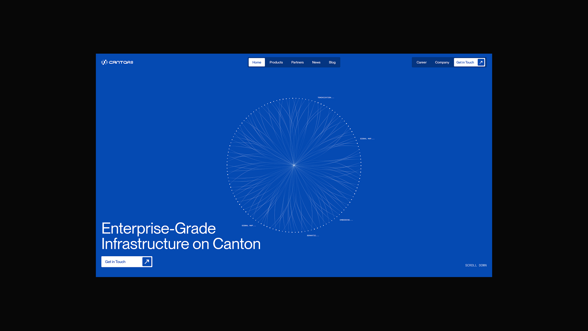
For the product visuals, this meant we could create a family of graphics using the same vocabulary. A new product could be introduced through another arrangement of familiar elements, without changing the main visual or inventing a completely different style. When developing a concept, I find this a useful point to check: can the idea work in another section, on an internal page, or with content that hasn’t been written yet? A strong first screen gives you a starting point. Trying the idea elsewhere tells you whether it can support a website.
Developing the Design
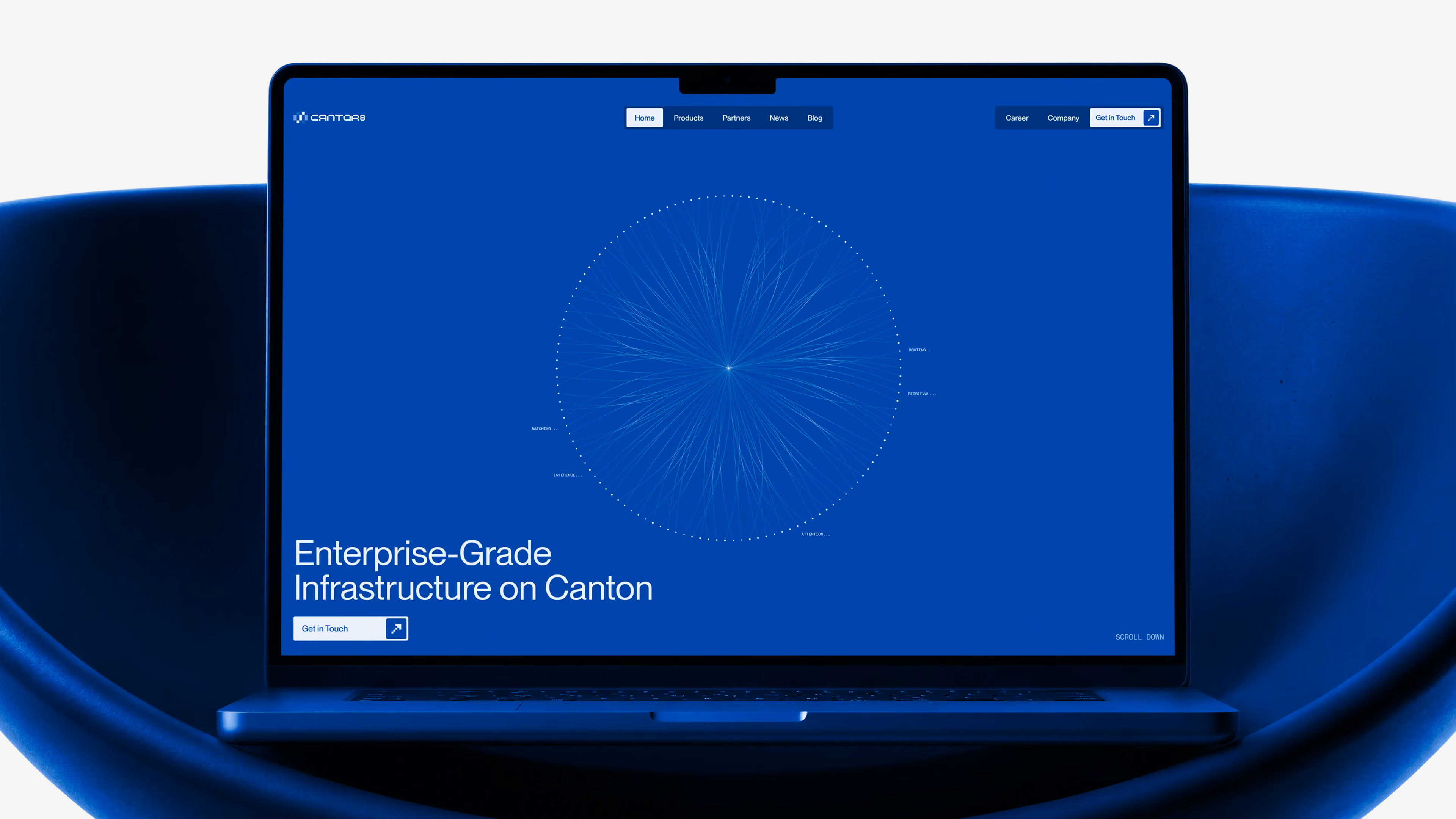
Once we had that direction, the design stage became about applying it at different scales. The opening visual uses a circular field of points and lines. It introduces the idea of a network, while the headline explains the company’s positioning. Further down the page, product descriptions and graphics bring the presentation closer to the individual parts of the business.
The graphics weren’t intended to explain every technical detail. They gave the content a recognisable visual context. The text still needed to tell visitors what a product was and why it mattered. This distinction helped keep the design clear. Abstract imagery can suggest connections and activity, but it cannot answer every question about a complex product. Pairing it with direct headings and descriptions gives each element a useful role.
Typography, spacing, and section structure were just as important as the visuals. Visitors needed to be able to move from the company overview to products, partnerships, and research without having to work out how the page was organised.
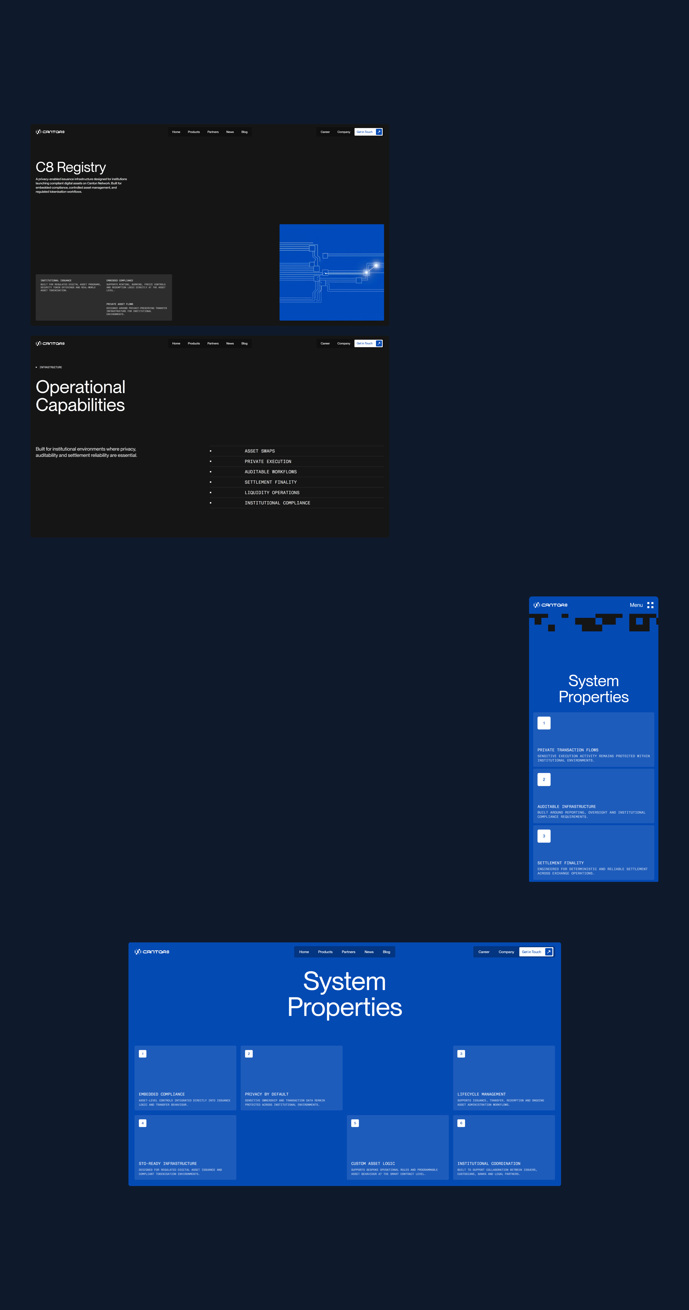
The connector idea gave us consistency across those sections, while leaving room to vary the layouts and the amount of information.
Bringing It into the Browser
The website was built in Webflow, with SVG, WebGL, and GSAP used to develop the motion and custom interactions. The first screen uses WebGL for the circular network visual. Seeing it in motion gives the points and lines a sense of activity that a still image can only suggest.
SVG offered another way to develop the connection idea. In the closing call to action, paths draw into place and pulses move along them. Labels such as asset issuance, custody, and execution connect the visual back to the company’s work.
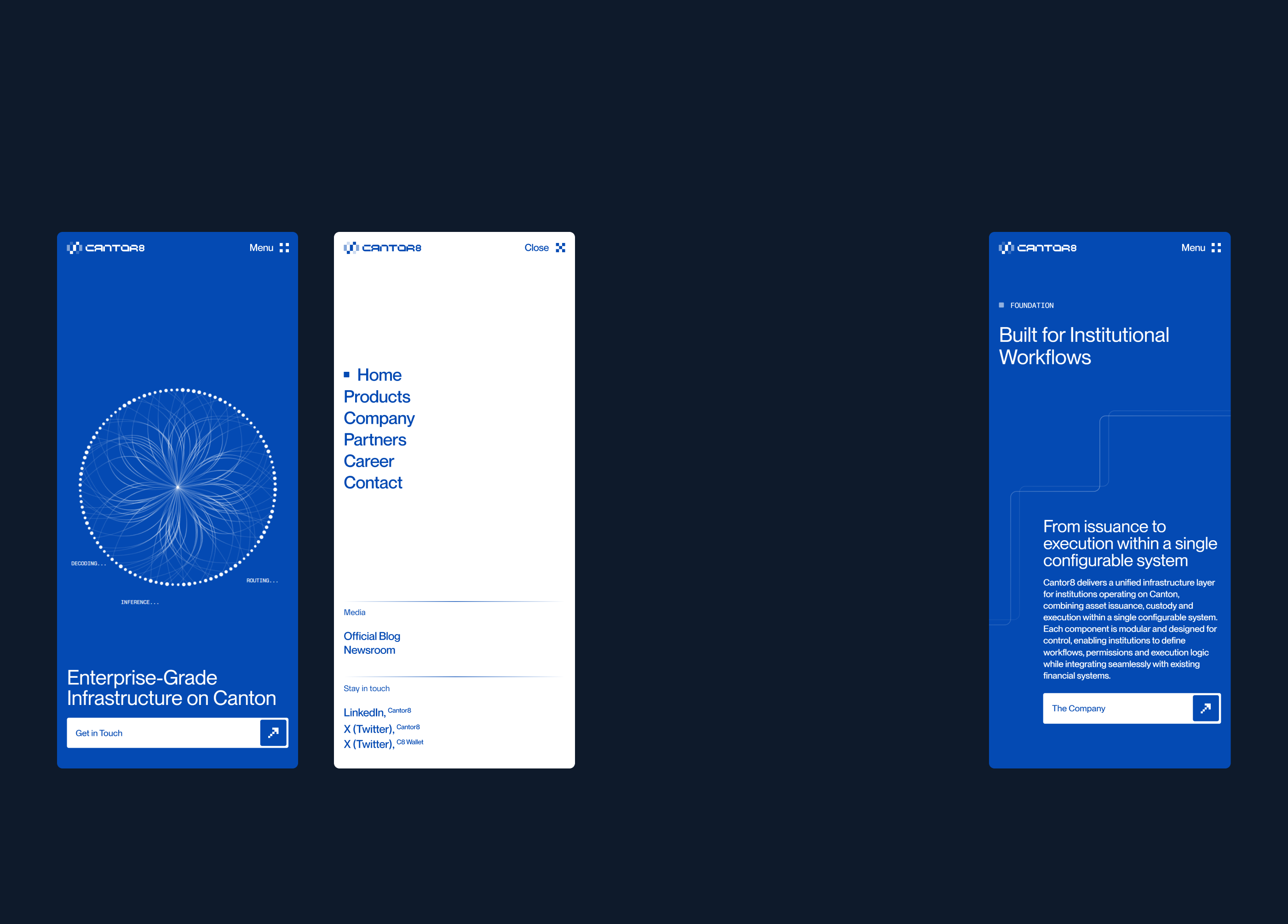
The pixel transitions between sections use GSAP ScrollTrigger. As the visitor scrolls, blocks change colour and gradually resolve into the next background. This extends the digital character of the design into the way the page moves between sections. These examples use different techniques, but they belong to the same visual direction. That relationship matters when adding motion. It gives you a basis for deciding which effects fit the project and how they should behave.
The browser also lets you assess things that are difficult to judge in a static layout. A transition may feel too long when you are trying to reach the next section. A graphic may need less movement once it sits beside readable content. Timing and scale need to be considered within the page itself. For me, this is why development remains part of the design process. You get to work on how the experience feels as someone moves through it.
Simplicity Takes Discussion
We arrived at the direction through roughly three or four iterations of the homepage, making decisions together with the Cantor8 team. During those iterations, new thoughts and additional context sometimes took us back to an earlier part of the design. We would reconsider a specific choice, adjust it, and continue.
This happens often in client work. You understand more about a project while designing it than you did at the first meeting. The team also has something more concrete to respond to once an idea becomes visible. The product growth discussion was one example. It helped us see a limitation in the initial concept that wasn’t immediately obvious from its appearance. Feedback gave us a better basis for judging the design.
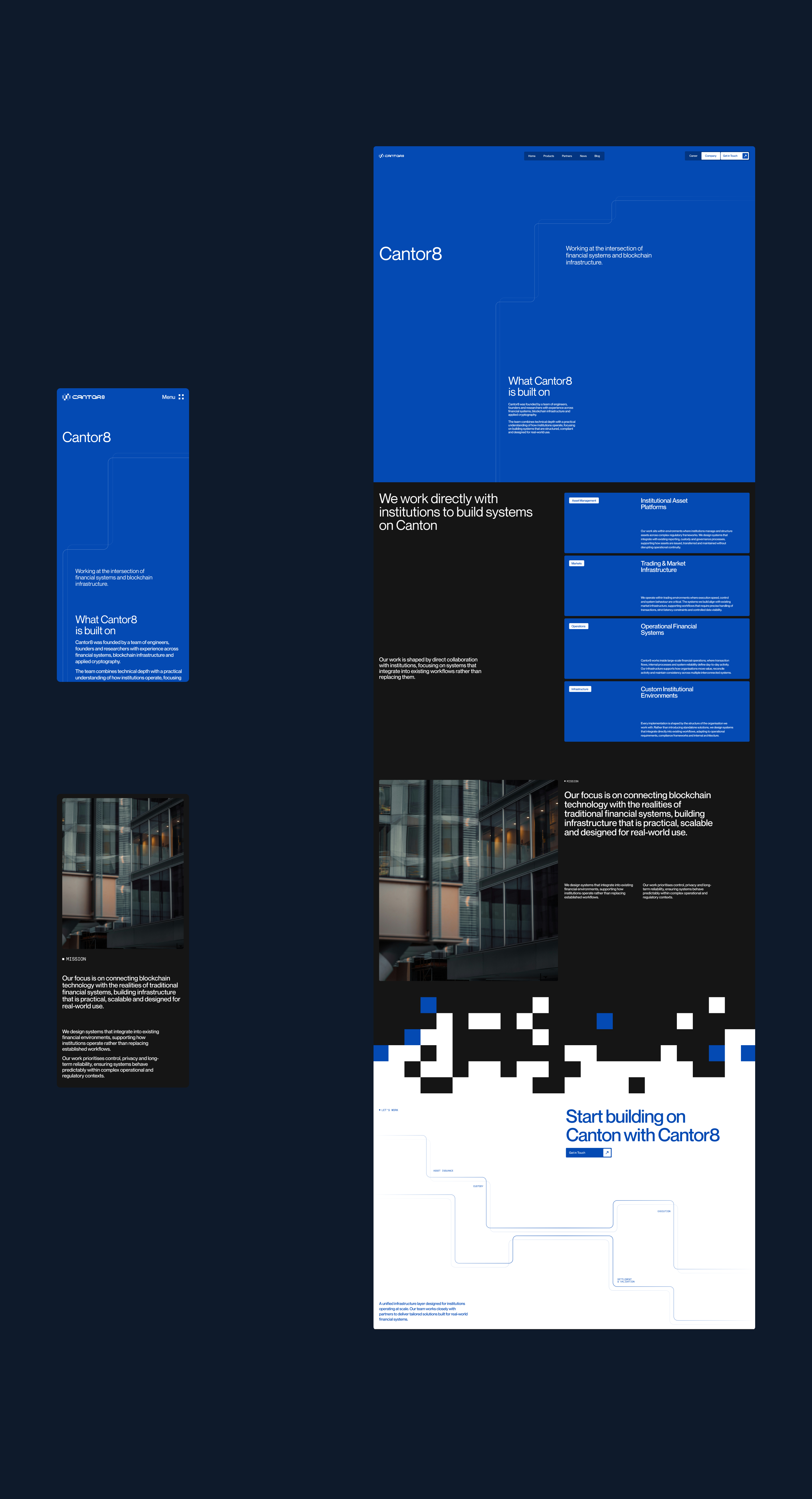
The useful part of communication is the context it reveals. Understanding why a product might change, who the company needs to speak to, or what a visual suggests to the team can lead to a much more considered decision. Cantor8 reinforced the value of leaving space for that process. We carried the idea of connection forward, changed the parts that limited it, and found a simpler way to use it across the website.
Recognition and Support
Cantor8 was featured in Behance’s UI/UX and XD galleries and received recognition and mentions across several design platforms. Thank you to everyone who featured, shared, or spent time with the project. I always appreciate your support. It means a lot to see the work reach more people and become part of the wider design conversation.
Explore the full case study on Behance or visit the live website.