.avif)

Translating the invisible rhythm of breath into digital form
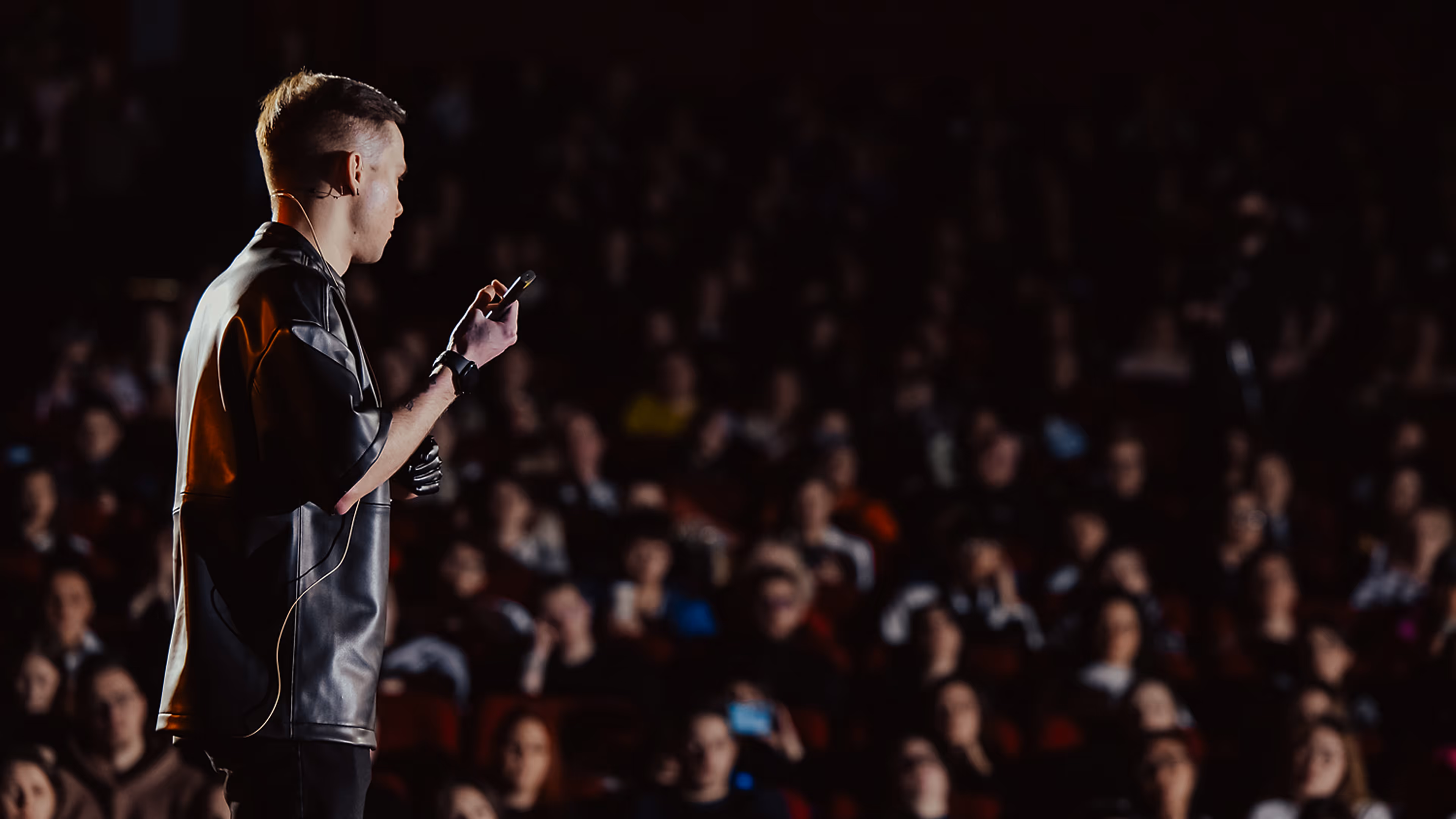
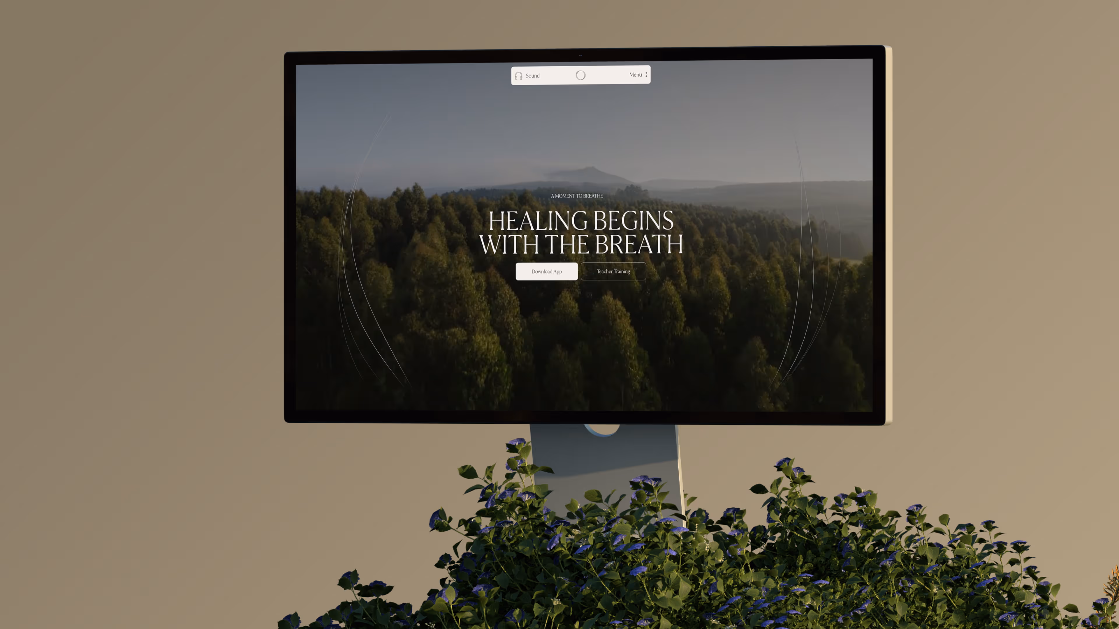
Breath is invisible, but it shapes almost everything: the nervous system, emotional state, attention, presence, and the way the body responds to stress. That became the central challenge behind Frequency Breathwork. The goal was not to design another website for a wellness practice, but to translate an intangible physiological and emotional process into a digital experience without reducing it to the usual visual clichés of the category.
At first, the project seemed like it could work through a restrained and familiar structure: clear sections, calm typography, natural imagery, and direct communication. But breathwork does not translate well into static pages. It unfolds through rhythm, repetition, intensity, and release. The deeper we moved into the concept, the more obvious it became that the website needed to behave less like a brochure and more like an environment. Something that could shift, expand, contract, and respond.
From Rhythm to System
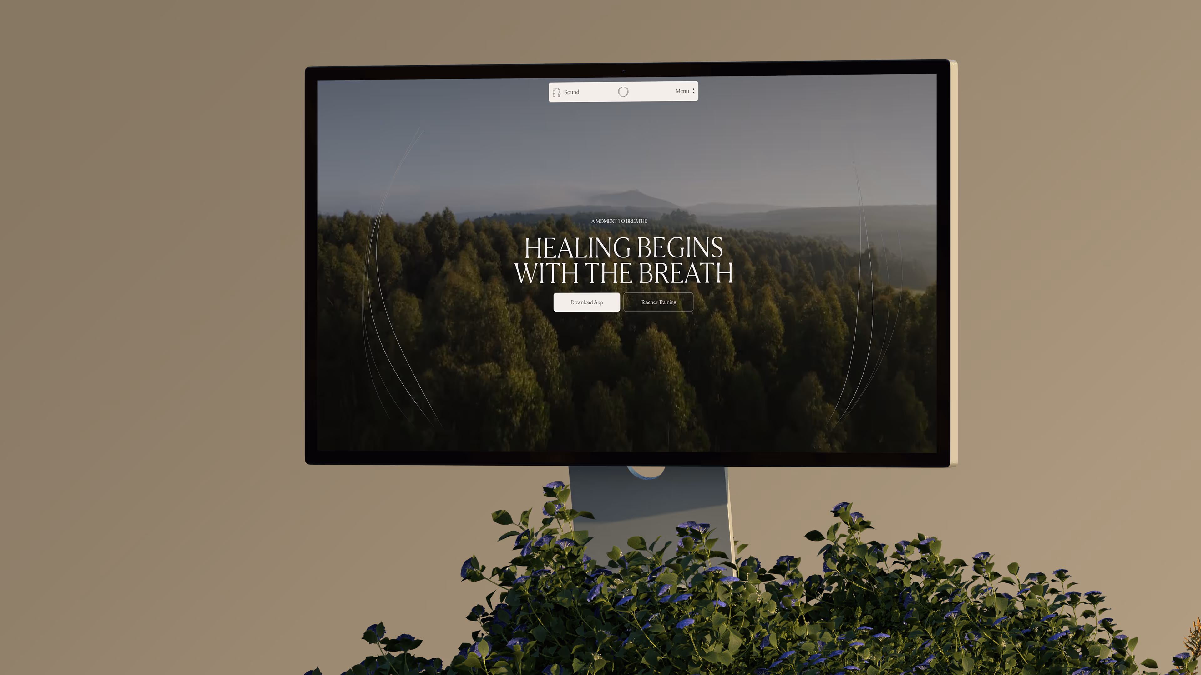
Once rhythm became the foundation, the structure of the website had to change. Breath does not move in a straight line. It loops, pauses, returns, accelerates, and softens. A traditional vertical layout felt disconnected from the nature of the practice, so the visual system began moving toward circular thinking: cycles instead of sequences, continuity instead of rigid hierarchy, movement instead of fixed composition.
The idea of threads emerged from that direction. They were not meant to illustrate breath literally, but to carry the feeling of frequency, tension, and resonance. Arranged as circular systems, the threads create environments rather than isolated graphic elements. They respond to motion, time, and eventually sound, giving the interface a living quality without making it feel overly technical or decorative. The goal was not to show breath. It was to create a system that behaves with some of the same softness, variation, and sensitivity.
Visual Language
The visual language was intentionally restrained because the concept already carried enough movement. Typography became the main structural tool, creating moments of presence through scale and contrast. Large type gives weight to key ideas, while smaller text recedes and allows the layout to breathe. White space was treated as an active part of the design, not an empty area to fill. It creates pauses between ideas, softens transitions, and gives the experience the same rhythm of intensity and rest that exists inside the practice itself.
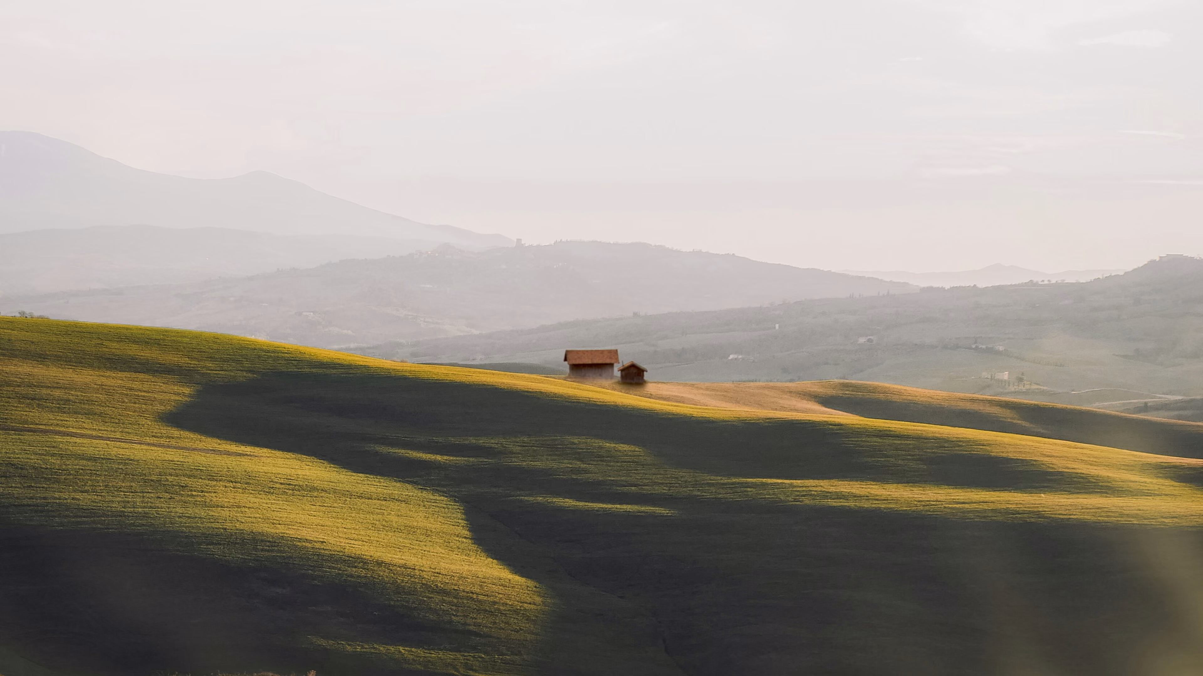
Natural imagery appears sparingly and works more like a pause than an explanation. It does not try to decorate the page or illustrate wellness in an obvious way. Instead, images create moments of stillness inside a more fluid system. This balance between abstraction, typography, space, and controlled imagery became essential to keeping the site calm without making it feel generic.
Interaction and Development
Interactivity was used only where it could add meaning. The goal was never to make the website feel complex for the sake of complexity. Some sections could have worked as static blocks, but interaction allowed them to communicate internal processes more directly. In those moments, motion becomes a continuation of the concept rather than a decorative layer added on top.
The core technical challenge was the dynamic WebGL thread system. Built with Three.js, the threads react to time, cursor movement, scroll behavior, and audio input. Sound is not mapped directly in a literal way. Instead, low-frequency energy is extracted, smoothed, and translated into subtle changes in tension and intensity. This helped avoid a mechanical audio-visualizer feeling and kept the motion closer to breath: soft, delayed, slightly imperfect, and never exactly the same twice.
Bringing this system to mobile required a separate level of control. WebGL combined with real-time audio processing can quickly become expensive on smaller devices, so the scene was treated as a lifecycle component. It initializes only when needed and is disposed of when it should no longer run. That allowed the website to preserve the feeling of the desktop experience without sacrificing performance.
.avif)
Conclusion
Frequency Breathwork became a reminder that not every website needs to compete for attention. Sometimes the strongest decision is restraint: knowing where not to add motion, where to leave space, and where to let the system remain quiet. Every decision, from typography and spacing to sound and WebGL, was guided by the same question: does this add meaning, or does it simply add noise?
What started as a simple wellness website gradually became a responsive digital environment shaped by the nature of breath itself. It does not rush, repeat exactly, or stay fixed. It responds.